Design Tactics #19 — How to level up your UI Kit with variables
Variables make your life a LOT easier by solving two major problems
Lately I’ve been channeling all of my creative energy into 🤿 Deep Dives so I’ve fallen a bit behind here. But there’s a new design tactic in Figma that I simply had to tell you about 👇
So far, one of the best use cases I’ve found for variables in Figma is using them to level up your UI Kit 💪
I was so excited when I figured it out that I made an entire lesson about it in Figma Academy 2.0 👀
So in this walkthrough, I’m going to first explain the two main UI Kit problems I wanted to solve, and then show you how variables make your life better 👇
Problem #1: Manually ensuring consistency across components
Components in our UI Kit should have a lot of shared attributes (padding values, border radius, height values, etc.).
That way, they appear cohesive when combined to form a page layout.
When you don’t match these attributes across components you can end up with some pretty wonky scenarios like this… not great 😬
The problem is that even though these core components might have shared attributes in code, we used to have to ensure consistency for each component manually.
That means we have to remember that `small` size variants should all be 32px tall with 4px border-radius. And each new component we add to our UI Kit also adds another knob that we have to turn to make future changes.
Problem #2: Breakpoints required new variants
A “large” button on desktop is still a “large” button on mobile (even if the pixel values are changing)…
So that means basically every component in our UI Kit required at least two breakpoint variants. Your `Button` component probably looked something like this (at the very least)👇
This also meant that we had to constantly change between these breakpoint variants in our files.
I don’t know about you… but it feels like I’ve done this workflow thousands of times in Figma 👇
How variables fix everything
❌ Eliminating breakpoint variants
For starters, we can say goodbye to all of those extra variants!
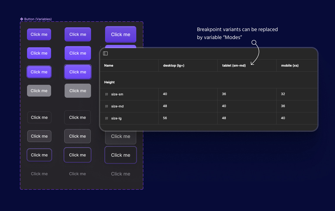
Now we can define our breakpoints as variable “Modes” within our UI Kit. This means all of your component sets immediately get cut in half 🙌
📐 Ensuring consistency
But that’s just the beginning… variables also make it 10x easier to keep our UI Kit components consistent.
Notice how I have three different sizes for my `Button` in the screenshot above? These are defined as a single “size” variant that exists in basically every component in my UI Kit (ex: sm, md, lg).
My goal is to be able to put a `md` input alongside a `md` select and have them share all of the core attributes (size, radius, etc.).
So this is how I’m currently thinking about my UI Kit variables 👇
Modes = breakpoints
Groups = component attribute (height, radius, padding, etc.)
Variables = [attribute]—{size variant}
In natural language, I’m saying “On {breakpoint}, this is the {attribute} for components using the {size} variant“.
From there we can use these new variables when creating our UI Kit components 👇
If you’re creating a `lg` button then you simply select the “{attribute}-lg” variable for whatever part you are styling.
That way you can be sure that every `lg` component matches perfectly 😍
And if you ever need to make changes, now you have a single variable that you can use to control every component in your UI Kit 💪
🤖 Automating breakpoints
Since we’re importing our UI Kit in every file that we’re designing pages, we can also use these variable modes to assign breakpoints to our parent frames.
That way, all of our core components will automatically adjust to use the correct styles (no more manually switching between breakpoint variants).
Notice how the button sizes respond automatically in the .gif below 👇
Wrapping up
There’s a lot of strategy around when to use variables vs. when to avoid them. It’s tempting to want to create a bunch of fluid resizing behavior and move as much of our logic as possible into the local variables panel…
A general rule of thumb 👇
Use variables to make your life easier, not to get your responsive behavior closer to the actual product.
Creating a system like this makes your life a lot easier so imo it’s the perfect example of where variables shine 🌞
If you’re ready to jump into the deep end and learn how to master all of the new Figma features then you can claim your spot in Figma Academy 2.0 today ✌️
There’s even a new Advanced Figma Training Program where you can interact with me, get feedback on your projects, and join weekly live Q&A sessions to go deeper into the material.
Hope to meet you there!
— Ridd


