

Design Tactics #16 — How to tailor your "Handoff" process
Learn about the different types of engineers and how you can tailor your process to who you are working alongside

“Handoff” gets a bad rap nowadays.
Mention it on Twitter and you’ll incite a whole wave of people yelling “waterfall” and talking about design being collaborative and how you shouldn’t be lobbing your designs over the fence.
Of course 🙄
But “handoff” is just knowledge transfer from design → engineering. Ideally it’s happening throughout a project (not just once design is figured out) and it’s a skill we can all refine as product designers.
The only way you can mess up is if you have ONE standardized handoff process ❌
Because how you work with engineers depends on WHO you are working with 👇
The different types of engineers
Engineers have two primary skillsets that are relevant to designers:
1) Product Thinking
2) Frontend Skills
You can think of each engineer falling on a little 4 quadrant graph 👇

Before I go any further… this graph does NOT equate to value.

A backend specialist might not care all that much about product thinking but could be one of the most crucial employees at a company...
This chart DOES impact how designers work though, because each type of engineer requires a tailored handoff approach 👇
Limited front end skills
Engineers in quadrants 1 & 4 might require a bit more hand-holding when it's time to get into the specific UI details.

So if I’m working with a backend specialist or someone a bit more junior...
I'll go above and beyond to annotate my designs (even if things might be available in the inspect panel like padding values or additional overlay layers).
Having some sort of a “Callout” component in Figma is great for this 👍 If you open up my files you’ll see this little guy absolutely everywhere :)

Here's a couple of specific examples of the types of details that I might include:


This is why having a basic understanding of how CSS works is super valuable because you can help with the nitty gritty of implementation details 🧠 By using auto layout you really have to think through the number of frames/divs needed to nail a layout and that kind of info can make a huge difference for some developers.
I might also include Loom breakdowns where I walk through some of the more complex layer structures too. Here’s a quick 50 sec example of one I made last week (engineers consistently tell me they appreciate this kind of stuff and it’s easy to make).
Frontend specialists
I love asking for visual feedback when working with someone in quadrant 3.

Some engineers want things to be mostly figured out product-wise but loooove to get into the details of CSS, transitions, hover states, etc.
So often times I'll drop stickies asking an engineer for help on a specific implementation idea. In this example I’m trying to figure out the best way to communicate that a calendar component scrolls horizontally on mobile 👇

Most of these low-level decisions aren't worthy of a Slack post.
But this way I can ensure I'm sourcing ideas from my frontend partner and keeping them involved in the process. It’s pretty common for them to come up with a better idea than anything I bring to the table 🤷♂️
Product engineers

If you're working with engineers in the top half of this chart, you need to involve them as early and often as possible.
Don't wait til you have something to show in Figma...
Their favorite part of the process is often shaping the problem/opportunity at the very beginning.
"Hey 👋 Do you wanna chat for a few minutes tomorrow about this new project? I’d love to have a lil jam session to get some momentum going…”
👆 This is a great way to kick off a project with people who consider themselves "product engineers".
It’s not always easy to spot the right approaches given technical constraints, engineering lift, etc.
So looping them in on day one can lead you down a much more desirable design path (that you might not have otherwise identified).
This happened just the other day at Maven… if I were left on my own I’d have started exploring an entirely different arena. But one of our more skilled product engineers identified a potential path forward that totally changes the UX and allows us to ship a big win in a fraction of the time.
💡 Don’t feel like you have to have an array of design directions in order to start the conversation.
Best of the best
I’ve been blessed to have a lot of new faces click the “follow” button lately (can’t say thank you enough 🙏).
So as a way to give back a bit, I went ahead and compiled (almost) everything I know about product design below:
Random Goodness
💅 UI Details
This entire thread by Derek is excellent. Campsite’s attention to detail is seriously impressive and I’m learning a lot from their product…

😮 Design inspiration
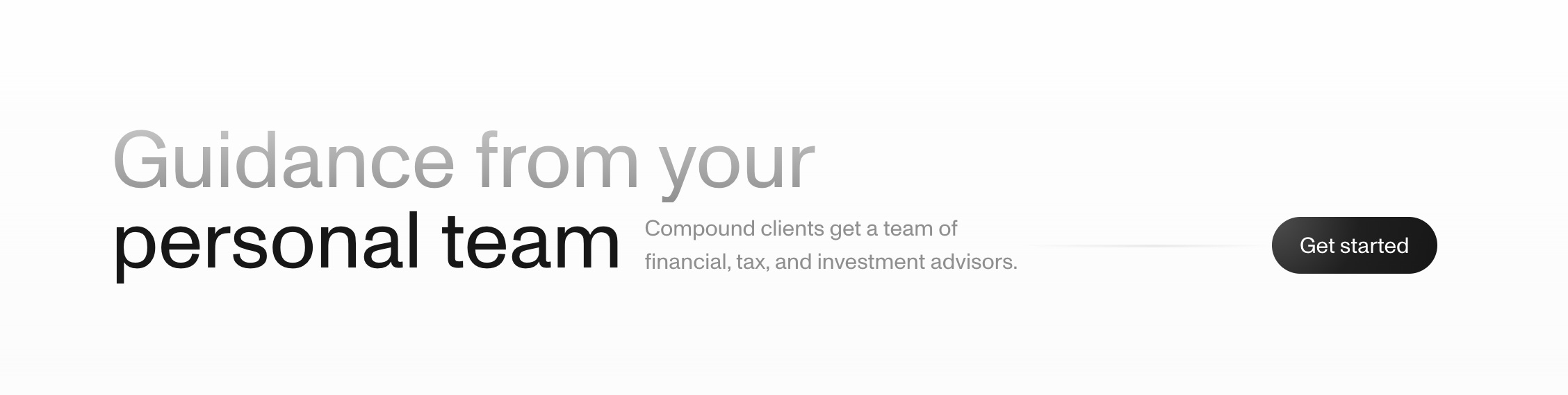
My favorite source of design inspiration from this week was the latest website from Compound. Specifically I can’t stop thinking about this alignment. 99% of the time this content would be vertically aligned, and yet SJ rolled out this thing of beauty 👇
👀 Something new is coming
The best design knowledge is trapped in private company Slack channels right now 🙄. So my new mission is to make as much of it freely accessible as possible.
How am I doing that you ask?
Well…I’m starting a new interview series where I go deep with the best designers I know so that I can share all of the highlights in bite-sized videos.
I’m still early in the process, but you can already listen to people like Bonnie Kate Wolf (designer of Netflix icon library) talk about her 3 principles for icon design projects. Or Steph Engle (designer at FB, Cruise, Airbnb, Snap) talk about mistakes to avoid while interviewing.
Not gonna lie… I think it’ll to be pretty epic and I can’t wait to build up momentum.
Is there anyone specific you’d like to learn from? Let me know and I’ll do my best to make it happen!
That’s all for now… enjoy the rest of your week :)
— Ridd
P.s. Hit reply and lmk what you thought of the “handoff” format. Do you prefer long form text or should I stick with more videos?